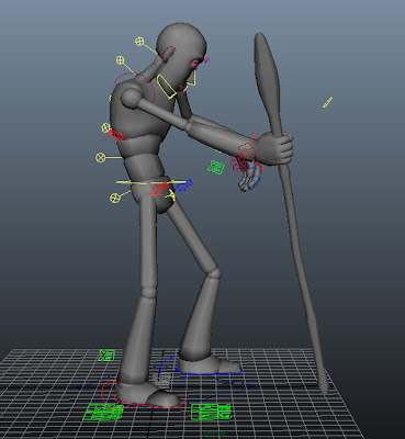
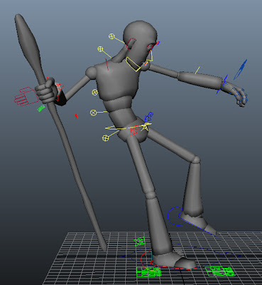
When creating this animation I repeatedly reminded myself of the 12 principles of animation and did as much as I could to implement them where possible. For example if you watch the character's movement immediately after being hit near the shoulder, I have shown follow through and overlapping actions of the shoulders and rotation starting from the clavicles down to the hips. I've tried to make the animation as appealing as possible, with use of exaggeration of it's movement. The staff, hands, legs and most of the other body parts are following an arcing path, with the ease in and out technique being used to provide a more believable animation.
The weight of the character was also taken into account, and can be seen when pushing himself back up using the staff. You can see the weight being handled first by the shoulders and then the spine. After recovery the character has been made to look weak or fragile, and so his movement is a struggle.
What I would have done different:
If I were to do this again I would like to further look into the problems I've had with pivoting issues on the staff/rig. I heavily implemented the use of the graph editor in order to control the rotation and translation of the staff seeing as it's pivot was at the right wrist joint rather than at the bottom of the staff; if the pivot was at the bottom of the staff then I could have controlled its rotation and translation on the floor to stop it moving better. I've not got a large amount of experience with rigging though, so I had the choice of either placing the pivot at the wrist or bottom of the staff, and so I chose the wrist as it better benefited the rest of the animation - having the ability to switch between the two different pivot placements would have been the most ideal case.
Final Struck Animation:
What's next?
All that is left to do now is to place my teams' animations together for cinematic use, with use of staging techniques among others such as lighting.


